Title Sequence Blogpost
- Get link
- X
- Other Apps
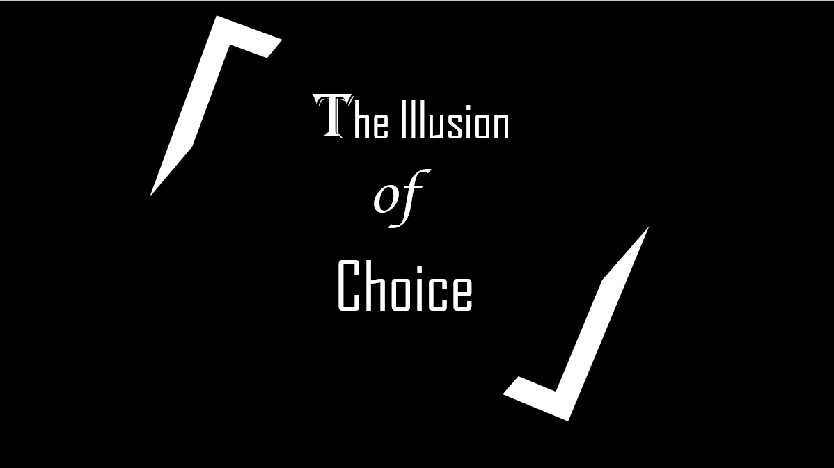
- We chose the font because it creates a mysterious aura around the film and the corners surrounding the title try to create a older feel and we wanted a simple yet iconic by creating a sleek and thin design. We went with a black background to create a sense of eeriness and fear. We arrived at this decision by talking about what the film is to us, and what it represents and what a physical manifestation of it would look like and we all brought our ideas together and created this title card.
this is a prototype we made to get a rough idea of what we wanted it to look like, we then later went back and revisited it and made it look better and more clean.

- Get link
- X
- Other Apps
Comments
Post a Comment