Posts

Lighting Blog Post

 We just used natural lighting for our movie opener, I had the blinds opened to let in light, and the lights turned on so it wasn't as dark. We wanted to make it feel as natural as possible, as if it were just a normal therapy session. I didn't feel the need to edit in extra light in production.
Editing Post 1 Blog Post

Image
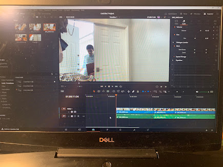
Me (Adam) cutting out unnecessary footage and raising the volume for some clips.             Me (Adam), the sole editor for this project. The only real problems I encountered was getting all the correct clips in order and making sure to not exclude any clips out. This was easily solved by just going through and watching our opener to make sure nothing was missed. For video effects we chose to add a recording camera effect, as if the entire conversation was being monitored and recorded. For video transitions not many were used, I added a additive dissolve, which I used to represent the camera turning on and begin its recording. Most of the clips use a smooth cut to make the transition seemingly flawless between different shots.

Title Sequence Blogpost

Image
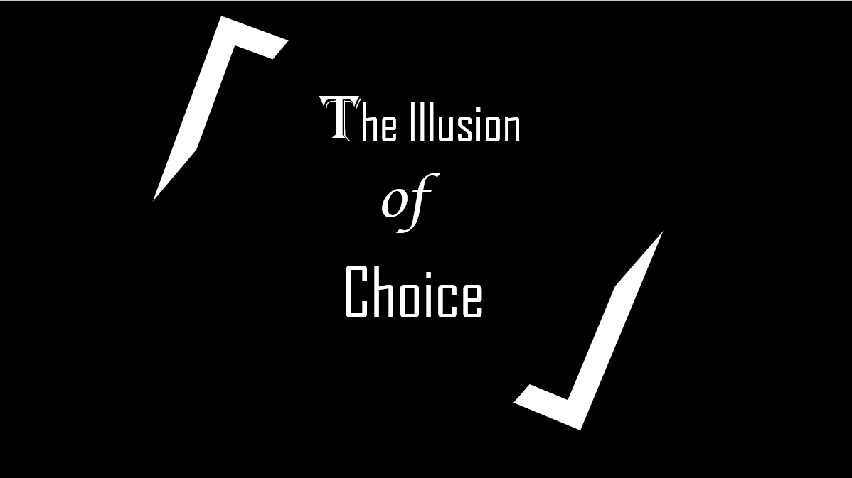
  We chose the font because it creates a mysterious aura around the film and the corners surrounding the title try to create a older feel and we wanted a simple yet iconic by creating a sleek and thin design . We went with a black background to create a sense of eeriness and fear . We arrived at this decision by talking about what the film is to us , and what it represents and what a physical manifestation of it would look like and we all brought our ideas together and created this title card . this is a prototype we made to get a rough idea of what we wanted it to look like, we then later went back and revisited it and made it look better and more clean.

Filming Blogpost

Image
 The first day of filming went well, we had some ups and downs, like getting the best angle, lighting, speaking loud enough, not laughing or messing up during takes, and not messing up the scene in general. The video looked very good and for the sound, at first we had to adjust to speak a little louder but then it came out good. We had to do several retakes and reshoots but nothing too major, just a line mess up or camera messing up.

Color Use Blogpost

Our 3 main colors were: White, grey, and black to represent the 3 moods of Sebastian's character. It shows how his character after the accident can only represent 3 emotions; Joy, irritation, and anger. 

Challenges in Filming Blogpost

 The challenges were scheduling a time we could all film, remembering lines, and being serious, as we ended up laughing a lot or not being overly serious during filming. We finally found a good time to all record, we would just refresh on lines, and we would give the actors a second to calm down and get ready for the scene. Everyone is pulling their weight and working perfectly together.

Representation blog post

 We are representing schizophrenic people, and to an extent people with mental illnesses. I think we are representing them pretty well, as we are showing some of the many effects that can happen, though we are exaggerating them just a little to make the opener more interesting. We are making sure to keep it as fair as possible without really veering off and making it completely stereotypical, we don't think there should really be much to change to Sebastian's character, as we all have a good idea of the symptoms of schizophrenia, so it won't be too unrealistic.